Jazz-Up Your Buttons with Gradients
June 01, 2022
4 min read

Michael P. McAuliffe
When used properly, gradients can add flavor to your layout.

When it comes to styling buttons there are a variety of approaches. Should the button be minimalist, or should the button mimic a piece of hardware coming off of your webpage? The answer depends on what you want your user to do. If the “call to action” on your page is a button, then that button should stand out against everything else on the page. Sometimes you may not want a button to scream, “CLICK ME!” at your users and there are plenty of ways to accomplish this too.
I am going to cover 2 methods for styling buttons with gradients in this post. The CSS property, border-image, can make your button pop, yet remain subtle enough not to disrupt your composition. However, the border-image property has some limitations, so I will cover another helpful property: background-image. Yes, background-image is also useful for styling buttons and is quite handy when you want your button to pop off the page.
Gradients on Buttons using the Border Image Property
1.button {2 border-style: solid;3 border-width: 4px;4 border-image: linear-gradient5 (180deg, rgb(170, 225, 255) 33%,6 rgb(100, 190, 255) 67%,7 rgb(50, 140, 255) 91%,8 rgb(25, 70, 200) 100%9 ) 1; /* Pay close attention to this 1 */1011 width: 180px;12 padding: 15px;13 background-color: transparent;14}
1<button class="button">Border Image</button>
This will create a basic button with border with a gradient and a transparent background.

Considerations
Accessibility is also another crucial factor of web development. You can ensure that the colors and font size you are using to create a high enough contrast ratio here.
It is also important to consider the transparent background of this button and how that may work on your composition under normal circumstances. This button will work better on a white background. But that may not be the case on every website so let's add a background to this button.
1.button {2 /* Previous code . . . */34 background-color: linear-gradient5 (0deg, rgb(210, 210, 210) 10%,6 rgb(230, 230, 230) 30%,7 rgb(240, 240, 240) 80%,8 rgb(255, 255, 255) 88%9 );10}
Or
1.button {2 /* Previous code . . . */34 background-color: linear-gradient(5 rgb(170,225,255) 33%,6 rgb(100,190,255) 67%,7 rgb(50, 140,255) 91%,8 rgb(25,70,200) 100%9 );10}
This fixes problems that can arise from transparency. Users may oftentimes have night-mode plugins on their browsers that may hide some content or make some things difficult to see.
Limitations
The border-radius property doesn’t work as expected on borders styled with the border-image property. There's a complex way to get around this issue, but I will not be going over that here.
Opera Mini, UC (Android), QQ, Baidu, and KaiOS Browsers only provide partial support for border-image with associated properties and values. For updates on border-image browser support check here.
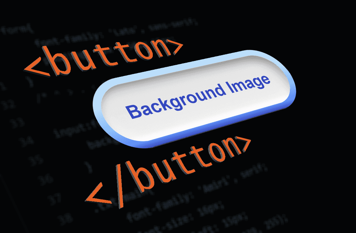
Gradients on Buttons using the Background Image Property
1.button-double-border {2 width: 231px;3 height: 77px;4 padding: 9px;56 border: double 1px transparent;7 border-radius: 50px;8 background-image: linear-gradient9 (180deg, rgb(210, 210, 210) 10%,10 rgb(230, 230, 230) 30%,11 rgb(240, 240, 240) 80%,12 rgb(255, 255, 255) 88%13 ),14 linear-gradient15 (180deg, rgb(170, 225, 255) 33%,16 rgb(100, 190, 255) 67%,17 rgb(50, 140,255) 91%,18 rgb(25, 70, 200) 100%19 );20 background-origin: border-box;21 background-clip: content-box, border-box;22}
1<button class="button-double-border">Background Image</button>
Using a double border with the background-image property will allow you to create gradient borders while incorporating the border-radius property into the design.

With buttons like these, I like to control the absolute size using the height and width properties. Border thickness can be controlled with the padding property. More padding means a thicker border.
Play with the background-origin and background-clip properties to see how those are vital for this component’s style. Using the background-origin property will ensure that both images will start in the upper-left-most boundary of the element. Without the background-clip property, the internal gradient wouldn’t have limits and thus expand to fill the element into its border. Removing this feature would cover our border gradient leaving only the gray/white background visible.

More Blogs
Avoid Pitfalls when Using Images in React
June 21, 2022
